fsLAW
MY ROLE: BRANDING, WEB DESIGN
Year: 2017
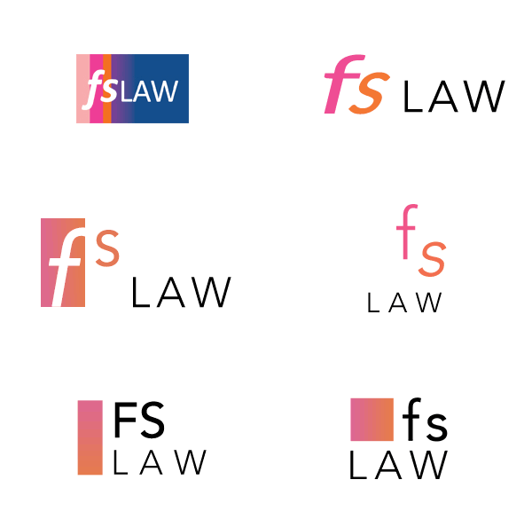
Lots of clients were already familiar with the company logo, so my goal was to keep it as close to the original brand look and feel yet make a modern refresh.
Lots of clients were already familiar with the company logo, so my goal was to keep it as close to the original brand look and feel yet make a modern refresh.


